Simple Album Cover Design Ideas: 15 Minimalist Concepts
Contact partnership@freebeat.ai for guest post/link insertion opportunities.
You’re exporting your next single at 2 a.m., the mix finally feels right—and then you hit the last hurdle: cover art. You want it to look professional in a tiny Spotify thumbnail, but you don’t want to spend three days designing. This guide breaks down simple album cover design ideas that stay minimal, readable, and on-brand—especially for creators shipping music fast.
Why “simple” works (especially in streaming thumbnails)
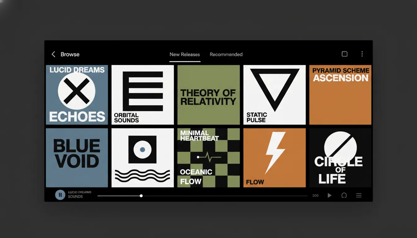
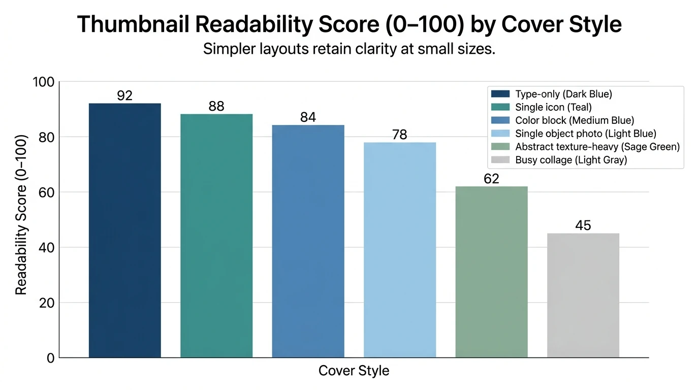
Minimal covers win because they survive reduction. On Apple Music or Spotify, your art is often viewed at postage-stamp size, where tiny details turn to noise. Clean shapes, limited color palettes, and strong typography keep the concept intact and recognizable.
From my own releases and client work, the biggest jump in perceived “pro” quality usually comes from two fixes:
- Higher contrast for legibility
- One clear focal point (symbol, photo subject, or title)
Quick checklist before you design
Use this 60-second brief to avoid wandering:
- Emotion: calm, aggressive, nostalgic, playful?
- Genre cues: electronic often supports minimal geometry; indie often supports sparse photography; experimental welcomes abstraction.
- One “hero” element: one object, one word, one shape, or one face.
- 2–3 colors max: plus black/white if needed.
- Type rule: if it’s not readable at thumbnail size, it’s not working.
Authoritative specs: most distributors recommend a square cover at least 3000 × 3000 px (JPEG/PNG) for crisp platform display and future-proofing. See guidance from DIY Musician on common cover art mistakes.
15 minimalist concepts: simple album cover design ideas you can actually execute
Each idea includes a “why it works” and a simple build plan. Mix and match.
1) Monochrome + one small centered icon
A single icon surrounded by negative space feels confident and modern. It’s also one of the fastest simple album cover design ideas to create.
- Do: black/white or single-color background
- Add: tiny symbol (heart, star, rune, waveform)
- Type: small, spaced-out sans serif at bottom
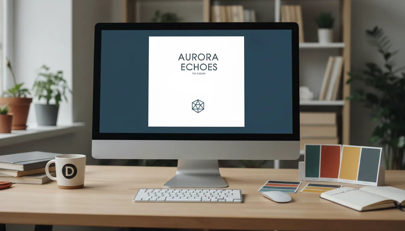
2) Type-only cover (title as the artwork)
Typography-led covers can be iconic (think “White Album” energy without copying it). If your album title is strong, let it carry the whole piece.
- Use one font family, 1–2 weights
- Oversize the title, crop it intentionally
- Keep artist name secondary
3) Color block split (50/50 or 70/30)
Color blocking is a proven way to pop in grid layouts and is easy to build with rectangles.
- Choose two complementary or near-complementary colors
- Place title on the higher-contrast side
- Keep alignment strict (centered or left-aligned only)
4) Single object photo on plain background
Minimal photography reads instantly. One object can represent the whole story.
- Shoot: one item tied to a lyric (keys, flower, lighter, mask)
- Background: white wall, bedsheet, or seamless paper
- Edit: reduce clutter, increase contrast slightly
5) Line drawing illustration (one continuous stroke)
A simple line drawing signals intimacy and craft—great for acoustic, indie, ambient.
- Draw in Procreate or Illustrator (or even paper → scan)
- Keep stroke weight consistent
- Place it small with lots of empty space
6) Micro-title + huge negative space
This looks “gallery” and expensive, even when it’s simple.
- Tiny text (artist + title), centered or top-left
- Texture optional (very subtle grain only)
- Test at 64×64 px to confirm readability
7) Geometric symbol (cross, circle, triangle) as a logo
Symbols become shorthand for your project. The Justice-style cross is a classic example of minimal impact.
- Pick one shape family (only circles, only triangles, etc.)
- Use one accent color (gold on black, red on cream)
- Lock spacing with a grid
8) Gradient rectangle “portal”
A small gradient block on a dark field feels modern and hypnotic—popular in recent minimal cover trends.
- Background: deep navy/black
- Center: small gradient rectangle
- Add subtle ripple rings or faint noise
9) Cropped portrait with one graphic intervention
A portrait can still be minimal if you remove context. Add one graphic mark to make it yours.
- Crop tight (forehead-to-chin)
- Add one bold shape (stripe, dot, lightning line)
- Keep type thin and unobtrusive
10) Repetition: one word stacked 6–12 times
Repetition creates rhythm—perfect for dance, techno, rap hooks.
- Stack the album title repeatedly
- Reduce opacity on all but one line
- Keep the palette to 1–2 colors
11) Handwritten note on flat color
It’s human and fast. Also one of the best simple album cover design ideas if you don’t want to “design.”
- Write title on paper with a marker
- Photograph/scan and clean background
- Place on a solid color with high contrast
12) Grid of tiny marks (minimal pattern)
A micro-pattern reads as texture, not clutter, when controlled.
- Build a 6×6 or 8×8 grid
- Use dots, dashes, or small icons
- Leave one cell “wrong” to create a focal point
13) Minimal abstract shape + subtitle
Abstract covers shine when you can explain them in one sentence (even if you never do publicly).
- Create 1–2 blobs or wave shapes
- Limit to two tones plus background
- Use small caption-like text (artist/title/year)
14) Vintage grain + restrained type
Retro can still be minimal if you keep the layout clean.
- One faded photo or texture layer
- One classic font (serif or narrow sans)
- Use plenty of empty space; avoid extra stickers/effects
15) Barcode / catalog label concept
This looks conceptual and pairs well with electronic, experimental, or compilation projects.
- Place a barcode-like block and a few lines of “metadata”
- Use monospaced type
- Keep everything aligned to a left grid
Which concept fits your genre? (fast matching table)
Color + type rules that keep minimal covers from looking “empty”
Minimal doesn’t mean blank; it means intentional. Use these rules to keep your simple album cover design ideas from feeling unfinished:
- Contrast beats style: readability first, always (especially at small sizes).
- One font family is enough: pair weights, not totally different fonts.
- Alignments matter: pick one alignment system (center or left) and commit.
- One accent color max: if everything is loud, nothing is.
For deeper principles (style = color + imagery + typography working together), see the practical breakdown in 99designs’ album cover guide.
A simple workflow you can finish in 30–60 minutes
If you want speed, follow this sequence:
- Pick one concept from the list (no hybrids yet).
- Set canvas to 3000×3000 px (square).
- Place the hero element (icon/photo/title).
- Add type last and test at tiny sizes.
- Export JPG/PNG and verify it looks crisp.
Tools that make this easier:
- Templates and fast edits in Adobe Express’s album cover maker
- Beginner-friendly layouts in Canva (just start at the right size), following DIY Musician’s Canva walkthrough
Make the cover work beyond the square: turn it into a music video identity (Freebeat AI angle)
A cover isn’t just packaging anymore—it’s your visual identity across Shorts, Reels, TikTok, and lyric videos. I’ve found that the best minimalist covers are also the easiest to extend into motion, because you already have one strong focal point, a clean palette, and clear typography.
With Freebeat AI, you can carry those same minimal elements into a full audio-reactive video:
- Use the same symbol or type lockup as an on-screen motif.
- Let beat-aware cuts and energy shifts (drops/sections) drive transitions instead of adding visual clutter.
- Keep character consistency if you’re building a recognizable artist persona with avatars or image-based characters.
To explore formats that pair naturally with minimal covers, see:
- Audio-reactive music video generator
- Lyric video maker with karaoke-style timing
- Dance video generator for beat-synced edits
Typography Design Tutorial in Canva
Common mistakes that get “simple” wrong
- Too many subtle textures: minimal + messy reads like an accident.
- Low contrast text: looks cool full size, fails on mobile.
- No focal point: viewers don’t know where to look.
- Over-trendy effects: glassmorphism and gradients can work, but only if they serve the music, not the algorithm.
A strong reminder from cover-art compliance and distribution realities: avoid designs that risk takedowns or rejections by following practical guidance like DIY Musician’s cover art rules and pitfalls.
Conclusion: pick one idea, commit, and ship
At the end of the night, your cover only has to do two jobs: look intentional and match the sound. The best simple album cover design ideas aren’t “less effort”—they’re fewer decisions, made on purpose. Choose one concept from the 15, keep your palette tight, test it at thumbnail size, and then reuse that identity across your next visuals.
📌 how freebeat ai helps you match your songs mood with ai generated cover art
FAQ (people also search)
1) What are the easiest simple album cover design ideas for beginners?
Type-only covers, monochrome backgrounds with one icon, and single-object photos are the easiest because they require fewer assets and clear composition rules.
2) What size should I export album cover art for Spotify and Apple Music?
Most distributors recommend a square image at 3000 × 3000 px in JPG or PNG for crisp display across platforms.
3) How do I make minimalist album covers look professional, not empty?
Use one focal point, strong contrast, consistent alignment, and limit your palette to 2–3 colors. Add subtle grain only if it supports the mood.
4) What fonts work best for minimalist album cover typography?
Clean sans serifs for modern projects and confident serifs for classic/editorial feel. Prioritize readability at small sizes over “cool” letterforms.
5) Should my name be bigger than the album title on the cover?
If you’re building recognition, artist name can be larger; if the title is the hook (EP concept, meme-able phrase), make the title dominant. Test both at thumbnail size.
6) Can I use AI art for a minimalist album cover?
Yes, but keep the output simple and ensure you have the rights to use it commercially. Minimalist designs often benefit from AI as a starting texture or single subject—then you refine typography and layout.
7) How can I turn my album cover into a short music video visual?
Animate your core elements (symbol, type, gradient) and let beat-synced transitions follow song structure. Tools like Freebeat AI specialize in audio-reactive pacing so the visuals move with your track.


