Drawing Creative Album Cover Art: 9 Style Prompts
Contact partnership@freebeat.ai for guest post/link insertion opportunities.
You’ve got a finished track and a release date circled—but the square image that sells the vibe is still missing. Drawing creative album cover art is where sound becomes a symbol: a thumbnail that hints at genre, mood, and identity before anyone hits play. I’ve been on tight deadlines where the cover had to “feel like the drop,” and the fix was always the same: choose one clear concept, then push it with composition, color, and type. This how-to guide gives you a repeatable process and 9 style prompts you can sketch today.
Why drawing creative album cover art is different from “just making a cool image”
Album covers work at two sizes at once: tiny (streaming thumbnails) and big (vinyl/poster/press). Good covers also act like branding—consistent visual cues make an artist recognizable across releases, merch, and music videos (research on album art’s role in modern discovery and branding supports this shift). A practical rule I use: if the concept doesn’t read at 200px wide, simplify the story.
Also, platforms can reject artwork for policy reasons (misleading text, promo language, URLs/logos, rights issues). Before you fall in love with a design direction, build with compliance in mind using distributor-facing best practices like DIY Musician’s cover art guidelines and Label Engine’s cover artwork tips.
The 7-step workflow (how to draw an album cover that survives real-world use)
1) Translate the song into a single visual sentence
Write one sentence that merges emotion + setting + symbol. Examples:
- “Euphoric club track about escape → neon stairwell that loops forever.”
- “Raw indie confession → messy hand-drawn character holding a torn receipt.”
Keep it literal enough to draw, but metaphorical enough to feel like music. If you want deeper inspiration, scan annual roundups like Creative Review’s best album art and design to see how pros connect theme to image.
2) Pick a “read-first” focal point
Decide what must be understood instantly:
- A face/character
- A bold wordmark
- A single object (symbol)
- A strong color field
Then design everything to support that focal point via contrast (value, saturation, size).
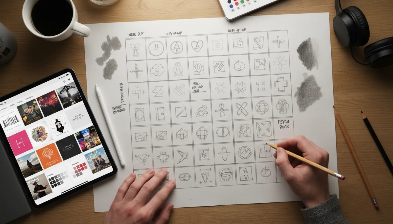
3) Thumbnail 12 tiny compositions (fast)
Do 12 sketches in 10–15 minutes. Keep each to 60–90 seconds:
- 1 centered portrait
- 1 off-center subject with negative space for type
- 1 extreme close-up
- 1 collage block layout
- 1 symbol-only minimal mark
This is the fastest way I know to improve drawing creative album cover art without “over-rendering” the wrong idea.
4) Lock format + safe zones early
Most distributors expect a 1:1 square master (often 3000×3000 px is recommended). Even if you’re drawing traditionally, plan the square and keep important content away from edges.
Use this quick checklist:
- Title/artist name legible at thumbnail size
- No tiny detail that becomes mush
- No URLs/QR codes/store badges
- Rights cleared for any photos/textures you didn’t create
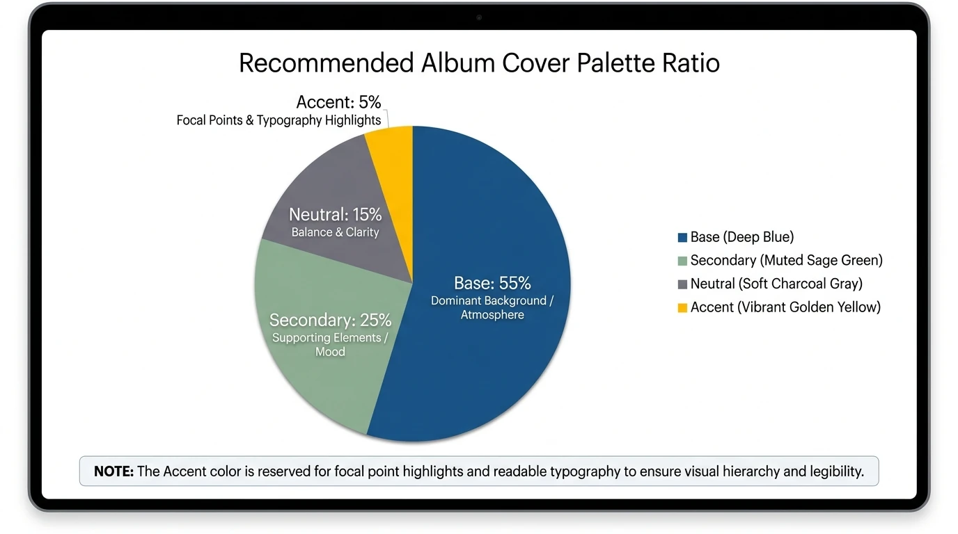
5) Choose a color strategy (3 colors + 1 accent)
Color is emotional shorthand, but it doesn’t reliably “prove” genre by itself—studies suggest color correlations exist but aren’t predictive alone. So treat color as support, not the entire message.
A simple palette method:
- Base color (background mood)
- Secondary color (subject)
- Neutral (type/contrast)
- Accent (tiny “spark” color)
6) Integrate typography like it’s part of the drawing
Typography isn’t decoration; it’s composition. Current trends emphasize bold, simple type that reads instantly, sometimes intentionally “ugly” or lo-fi. Make type decisions early:
- Sans serif = modern/clean/club
- Serif = classic/literary/heritage
- Handwritten = intimate/DIY
- Condensed bold = punchy thumbnail impact
I often sketch type as shapes first (rectangles), then refine into real letters.
7) Stress-test across use cases (cover → motion)
Once your still cover works, test it as a moving identity. This is where Freebeat AI’s approach is relevant: because it understands BPM, drops, and sections, you can turn your cover’s shapes, textures, and type into audio-reactive motion—camera movement on downbeats, transitions on bar lines, energy changes on the drop.
If you’re building a release package, consider pairing the final cover with:
- A 10–15s audio-reactive teaser
- A lyric video variant with the same palette/type
- A performance visual loop with your cover motifs
(If you already have a brand kit, align these assets so your audience recognizes you instantly.)
Quick comparison: 9 style prompts (and when to use each)
Use the table as your menu. Each prompt is written so you can draw it by hand or use it as a direction for digital illustration.
The 9 style prompts (step-by-step mini directions you can draw)
1) Minimalist symbol cover (the “one-mark” approach)
Start with a single object that represents the track (match, key, flower, satellite). Draw it larger than you think, then remove detail until it feels iconic. Keep the background nearly flat, and use one accent color to punch the focal point.
2) Vintage sepia revival (retro without looking fake)
Sketch a portrait or band silhouette with simplified shadows. Add a border frame and one retro motif (sunburst, badge, film edge). Finish with restrained noise and a type lockup that looks printed, not pasted.
3) Abstract geometric bold (draw the beat as shapes)
Draw 5–12 repeating forms (circles/rectangles/triangles) and vary size like a drum pattern. Use strong value contrast so the cover reads as a thumbnail. Align typography to the same grid so it feels “built,” not floating.
4) Surreal dream metaphor (one impossible idea)
Pick one surreal swap: “ocean in a teacup,” “stairs into a cloud,” “hand holding a tiny moon.” Render the lighting carefully—surreal works when the physics of light feels real. Keep text small; the image should do the talking.
5) Grunge distressed texture (controlled chaos)
Draw a simple central subject (face, object, logo) first. Then distress around it: rough strokes, torn edges, photocopy textures, uneven ink. Preserve clean space for the artist name so the cover still sells on streaming.
6) Indie DIY illustration (make imperfection a style)
Draw with a consistent pen brush and let line wobble show. Add small narrative details (ticket stub, grocery list, doodled stars) but cap it at 3–5 “story clues.” I’ve found this style wins when the title feels like a personal note.
7) Metal dark emblem (symbol + atmosphere)
Design an emblem (shield, crest, circular sigil) with symmetry and sharp shapes. Use a limited palette—black + one metallic tone often works. Add smoke/flame only where it frames the emblem, not where it competes with it.
8) Glitch futurist cyber cover (digital tension)
Draw a clean base image first (helmet, city block, portrait). Duplicate key edges with slight color shifts (cyan/magenta) and add a few “signal breaks.” Keep the focal point high-contrast so the glitch feels like an effect, not a blur.
9) Collage storyboard (curated layers)
Collect 6–10 elements max: 1 hero photo/illustration, 2 textures, 2 symbols, 1 label/stamp, 1 handwritten note. Arrange in a clear Z-flow so the eye knows where to go. If everything is loud, nothing is.
Make your cover “move” (optional, but powerful for launches)
Once you finish drawing creative album cover art, you can extend it into short, music-synced visuals for socials:
- Animate only 2–3 elements (eyes blink, grain drift, light sweep)
- Tie cuts to bars and drops so it feels intentional
- Keep the album title readable throughout
This is where a music-structure-aware tool matters. Freebeat AI’s audio-reactive workflow can turn your cover’s shapes and type into a consistent visual identity across teasers, lyric clips, and full music videos—without manually keyframing every beat.
How To Make Music Video With AI | FreeBeat AI (Full Tutorial)
Common mistakes (and fast fixes)
- Too much detail, no focal point: Blur the canvas; if nothing stands out, simplify and boost contrast.
- Type is unreadable at thumbnail size: Increase font weight, add a solid backing shape, or reduce wording.
- Random symbolism: Replace “cool objects” with one metaphor tied to the chorus or title.
- Palette fights the mood: Rebuild as 3 colors + accent; test in grayscale for value hierarchy.
- Policy risk: Remove URLs/logos/promo phrases; verify usage rights for every asset.
For more prompt-style inspiration (especially if you’re brainstorming directions fast), scan curated prompt lists like OpenArt’s album cover prompt roundup.
Conclusion: your cover is the listener’s first beat
Drawing creative album cover art isn’t about drawing everything—it’s about drawing the right thing so the music has a face. When I’m stuck, I go back to thumbnails, pick one metaphor, and design for the tiny square first. If you build a cover with a strong focal point, controlled palette, and readable type, you’ll have artwork that holds up on streaming and scales into a full visual era.
📌 how freebeat ai helps you match your songs mood with ai generated cover art
FAQ: Drawing creative album cover art
1) What size should I draw album cover art for streaming?
Aim for a square master and work large so details stay sharp when scaled down; many distributors recommend high-resolution square artwork (often 3000×3000 px).
2) How do I make album cover art readable as a thumbnail?
Use one clear focal point, strong value contrast, and typography with enough weight and spacing to survive small sizes.
3) Should I use typography as the main design element?
You can—bold typography is a major modern approach. Just keep hierarchy clear and test legibility on a phone screen.
4) How do I choose colors for an album cover?
Start with mood, then build a limited palette (3 colors + accent). Don’t rely on color alone to “signal genre.”
5) What should I avoid putting on album artwork for distributors?
Avoid URLs, QR codes, store badges, promo phrases (“Out now”), misleading artist names, and anything you don’t have rights to use.
6) How can I turn my album cover into a short promo video?
Animate 2–3 elements and sync cuts to beats/bars. Audio-reactive tools can automate timing so motion matches the song structure.
7) How do I keep a consistent visual identity across releases?
Reuse a core palette, type system, and recurring symbols/characters—then vary one element per release so each cover feels new but recognizable.


